2024 - Case study
Enzuzo: Shaping an engaging onboarding experience
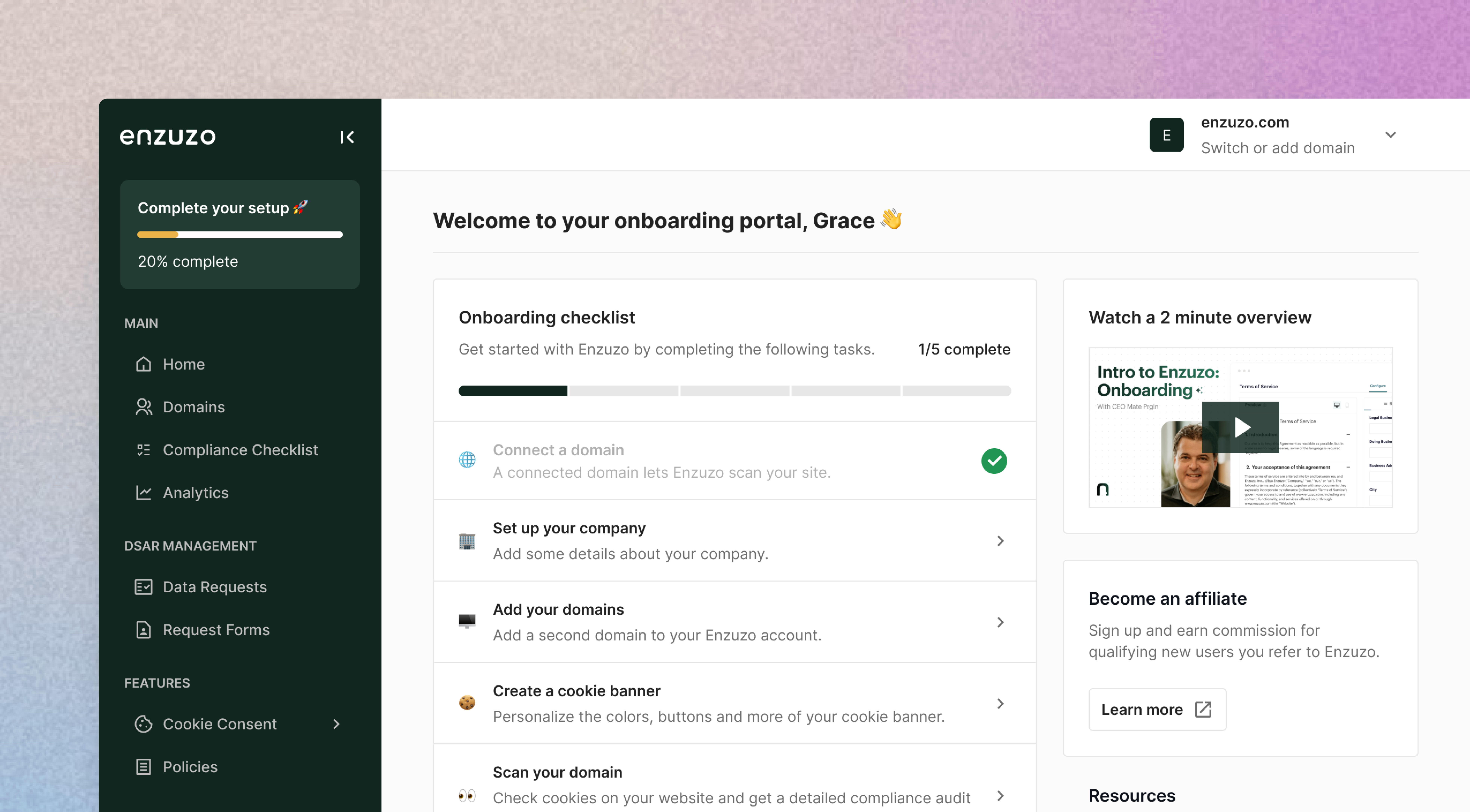
First impressions are important. At Enzuzo, we sought to define the user onboarding experience by creating lasting impressions that set the stage for long-term success.
TIMELINE
2 months
July - August 2024
TEAM
2 Designers
3 Software Engineers
TOOLS
Figma
PostHog
Hubspot
Jira
DISCIPLINES
UX Research
UI Design
Product Strategy
Product Marketing
OVERVIEW
Enzuzo is a data privacy management software that allows businesses to comply with global data privacy laws including the GDPR, LGPD, CCPA, and more. Over the summer of 2024, I spent 2 months designing a new onboarding screen to increase user delight and reduce churn for 30,000+ users.
We built an experience that allowed users to familiarize themselves with the product faster and more efficiently, setting them up for long-term success.
CONTEXT
Setting the scene: compliance is complex
Compliance is a hard topic to grasp. Regulations are always changing, and new ones are constantly being introduced. Many regions don't have a singular law that covers all of data privacy. Instead, it has a mix of laws that go by long acronyms like HIPAA, FERPA, etc.— keeping track of all of this is difficult for the average person.
💡
This leads to the primary value proposition of Enzuzo: a cost-effective solution that automates the compliance workflow for you.
Enzuzo has a high time-to-value compared to other SaaS applications. For example, you can watch a movie immediately after creating a Netflix account. But as is the case with Enzuzo, a new user has to create their own profile, fill in their company information, answer a long series of compliance questions, and install code on their website to launch a feature. This combination of tasks, decisions, and upskilling requires a willingness to invest in a set-up process— something that hurts our user retention.
PROCESS
The problem
Throughout Enzuzo’s 4 year lifespan, our software has seen numerous iterations of onboarding workflows and dashboards. As our company has grown, and as our customer base has evolved, it has become increasingly clear that our current interface was no longer meeting the needs of our users.
A (small) sample of some past Enzuzo dashboards.
We noticed that users were falling off before they hit their activation point. While sign-ups were high, feature install rates and user conversion was low. It was in the best interest of the company to critically challenge and rethink past assumptions to better align with their needs.
We identified the following problems with our user experience:
📢
The current dashboard is too noisy
Our current dashboard has several widgets, largely unrelated to one another. This large clump of information, new feature advertisements, and pop-ups create ‘noise’. As a result, users don’t pay attention to the content, rendering the dashboard largely useless.
🛏️
Too much decision fatigue
Enzuzo features are, by default, long and tedious to fill out. This increasing difficulty of answering questions may lead people to avoid making them. This may manifest as churn.
🤔
Difficult to navigate/utilize the full set of Enzuzo features
Enzuzo has an arsenal of features. However, many of our users sign up for just one and do not install the rest of our compliance suite. We noticed that many of our customers were unaware or uninterested in our other offerings, leading to low adoption rates.

Enzuzo dashboard before redesign.
Now these are ALOT of empty states. When designing empty dashboards for new users, it's important to avoid information overload. The goal is to guide users without overwhelming them. Too many empty states that were not well designed were frustrating users and lead to app abandonment.
Phase 1: Research
We began this project with extensive research into our customer base, collecting information from user interviews, competitive analysis and data from Hubspot and Posthog.

1. User interviews, 2. PostHog data, 3. competitive analysis.
For market research, we examined competitors in the data privacy industry as well as CRM apps, which generally have longer time-to-value periods.
From here, we synthesized all the information we gathered into a few key points, creating actionable insights for steps moving forward. Based on this, we created 4 goals for this project:
User flows
To pinpoint where we were going wrong, we created a flow chart of our current onboarding. Visualizing how a user moves through our product allowed us to see the bigger picture and consider the effectiveness of its overall structure.
Old Enzuzo onboarding user flow; which results in decision fatigue
We discovered that the current onboarding process is lengthy and involves too many steps. Almost every stage after sign-up requires answering a lengthy series of questions— something most people don't end up finishing.
Affinity mapping
With the insights that we gathered, we used an affinity map to narrow down problem areas and explore possible solutions.
We brainstormed many different ideas pertaining to increasing user engagement and retention such as redesigning the sign-up flow or product walkthroughs.
The result? Due to scope limitations, we decided to focus solely on the dashboard— a user's first touchpoint with our product. We sought to leverage our dashboard as a powerful tool for user exploration, setup and retention.
Which layout?
After we understood what we wanted to live on the dashboard, the next question I asked was: How are we going to display this information?
Presenting a lot of information upfront is always daunting, so we needed to understand what was of utmost importance to the user. I began sketching possible layout configurations.
We debated between both variations. I conducted a ton of outside in research to really validate a decision. We determined that if our goal is to guide users to their “aha!” moment and drive product adoption, it would be best to go with option #1.
The paradox of the active user
The "paradox of the active user" is a concept used to explain a common observation in complex applications that users never read manuals but start using the software immediately. We noticed this same pattern in our user interviews.
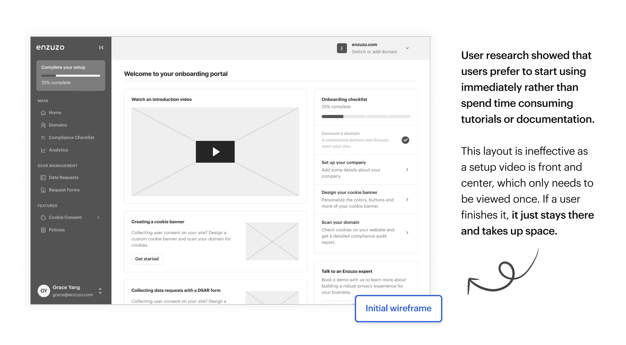
The primary issue we were dealing with was that users did not know where to start to use the software immediately. This is why we prioritized the checklist, giving users an immediate action item to promote learning by doing.
SOLUTION
A whole new world (dashboard)
Our solution began with designing a dedicated dashboard for onboarding called the ‘Onboarding Portal,’ which users would see when they complete sign-up. This portal would live in the left-hand navigation and disappear once the onboarding process is finished, significantly simplifying the main dashboard and reducing clutter.
We did this by applying the following concepts:
🌊
Dynamically changing content
This includes text and images. It should be framed to align with their goal.
🥇
The order that features are introduced
On the dashboard, prioritise the things they'll actually want to use.
👀
Hiding irrelevant features
If there's something you know they're unlikely to use, turn it off by default.
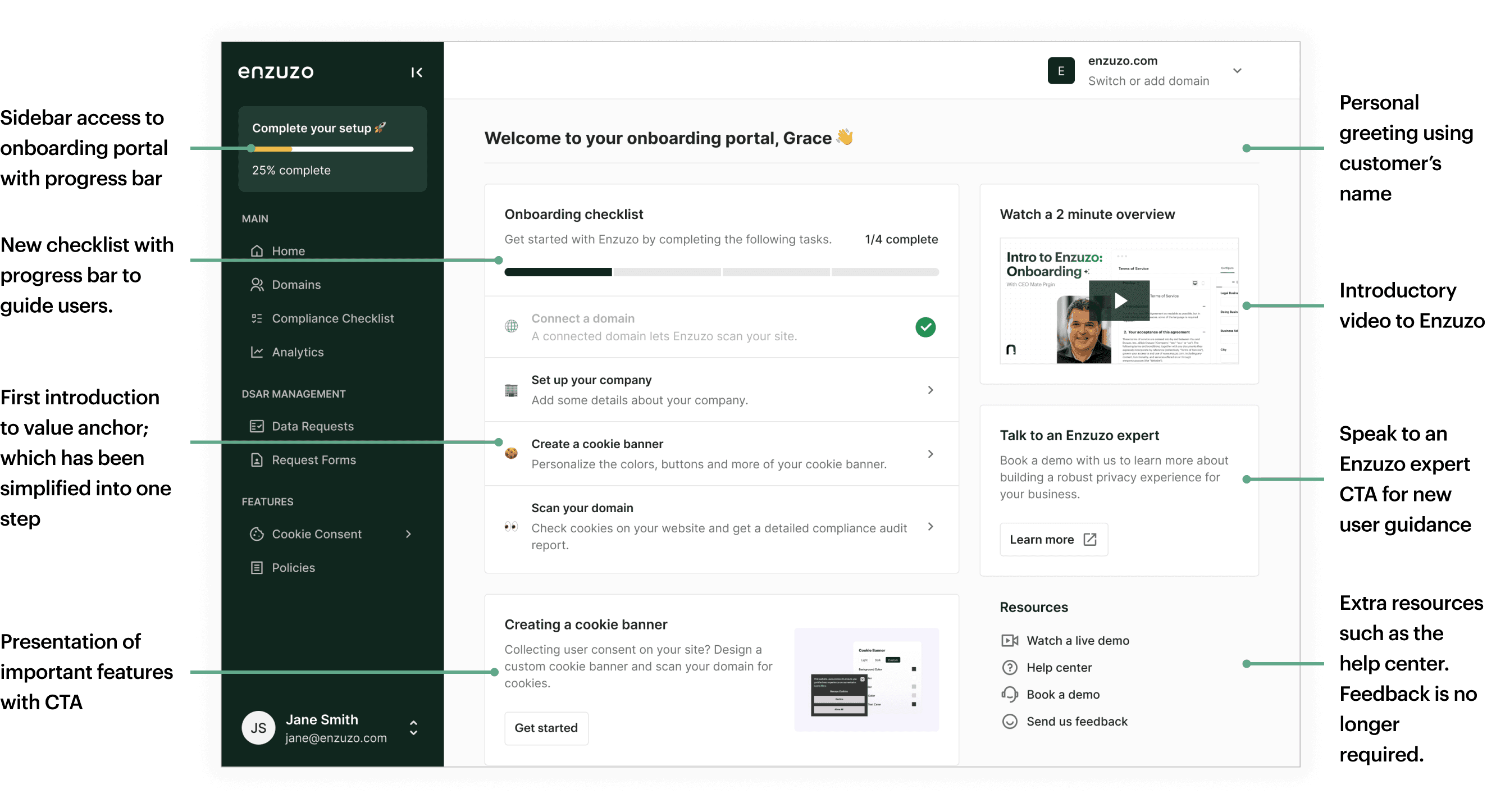
This new onboarding portal focused on introducing the app to new users, providing proper resources and a starting point for long-term success. An introduction video has been added, as well as various help-docs and important feature highlights.
Dynamic content for every persona
We noticed that customers on different plans had different needs, making it important to consider dynamic content. For example, a mid-size Shopify e-commerce store wouldn't have the same compliance goals as a big enterprise or a web development agency.
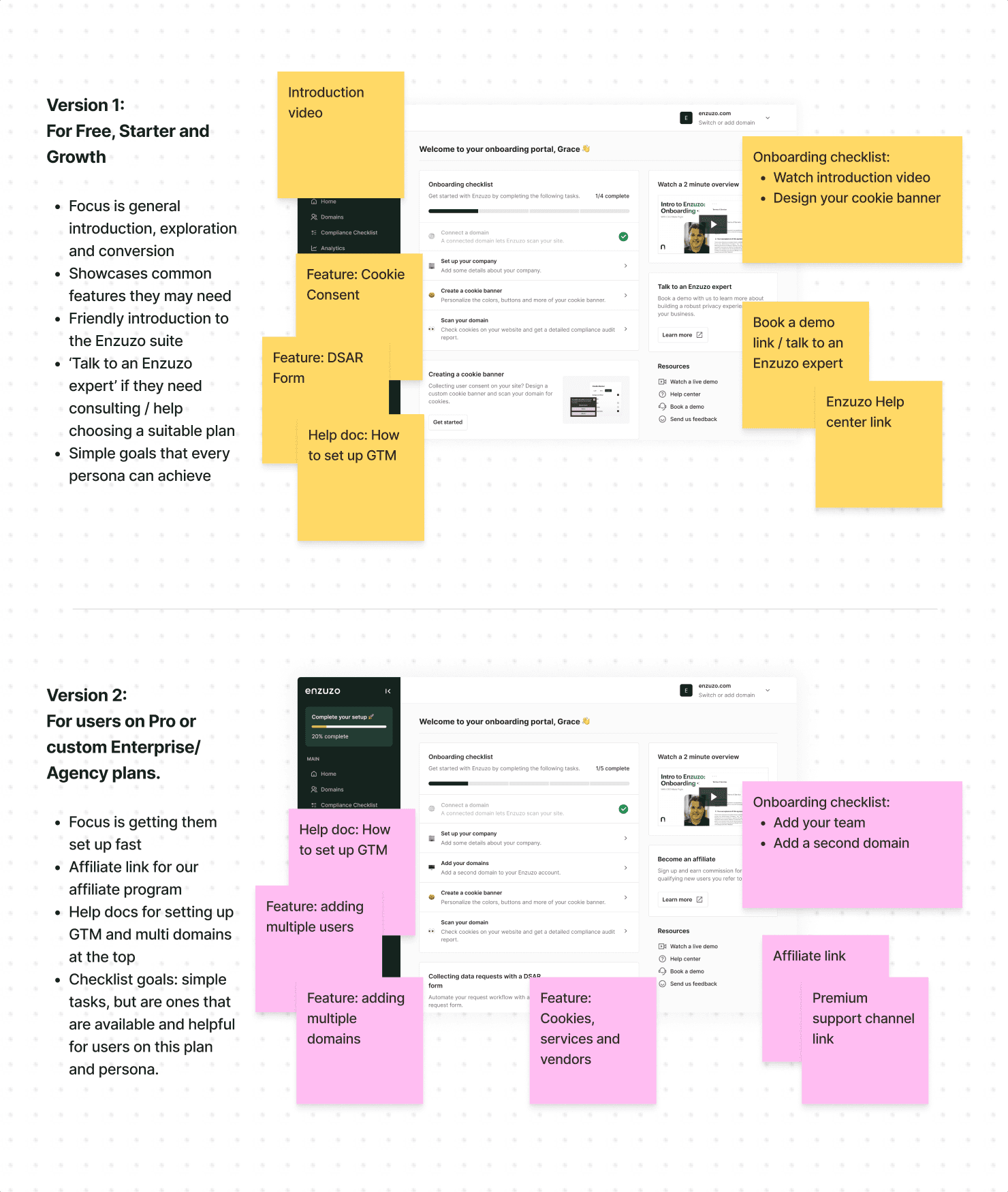
We developed two different onboarding versions, changing elements like help documents, widgets, and checklist steps to better align with user needs.
The problem with the checklist
💡
Fact: most people sign up for Enzuzo knowing they need one thing: the rest is just supplementary.
In our user interviews and surveys, we found that 90% of our users onboard for cookie consent. This includes the set-up and installation of a cookie banner, preference center, and cookie list. The average time it takes for a user to complete all of this is 34 minutes.
This takes us to the onboarding checklist— it was unattainable. It required the setup and installation of several Enzuzo features, an unrealistic standard for users to complete. Enzuzo features are lengthy to install, and if a user didn’t want to use just one of them, the checklist would never go away.
See step 4 on the before— it's actually much longer than one step.
We simplified the checklist and focused on attainable actions. We leaned towards making feature adoption appealing, not mandatory. By showing users the value of our features, we increase usage and retention without force. Otherwise, you are left with an unsatisfied (and annoyed) user base.
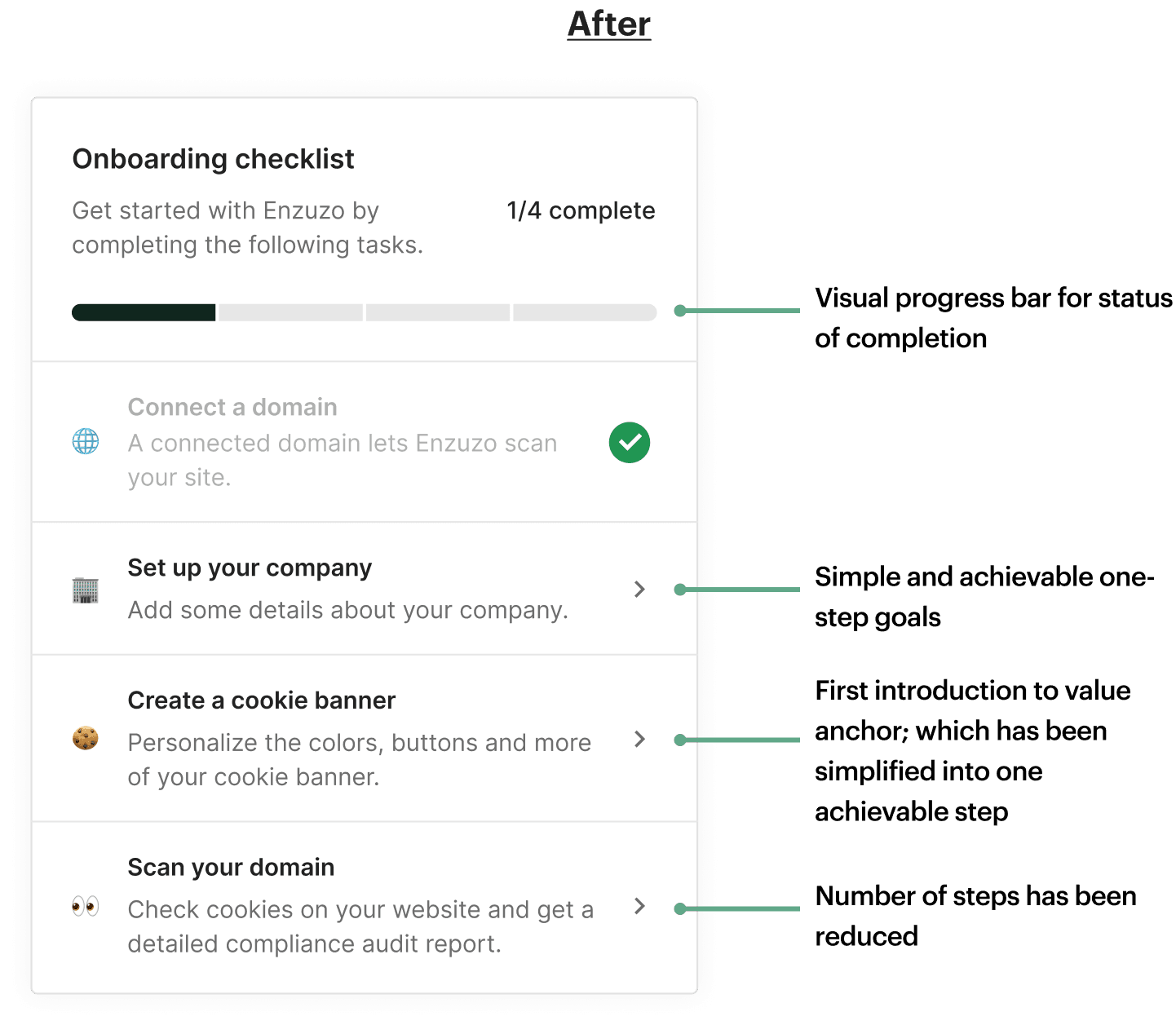
The new checklist focuses attainable steps for learning by doing.
A hub for your features
We determined that feature adoption rates were low partly because users were uninterested— we weren't properly communicating visibility or value. Features were accessed through the left-hand sidebar, which was hidden in drop-down tabs. Users were unaware of what they didn't have, as it was easy to ignore.
Simplifying the sidebar navigation.
Thus, we removed this nested navigation and created a hub to visually see every policy, similar to apps like Framer and Figma.
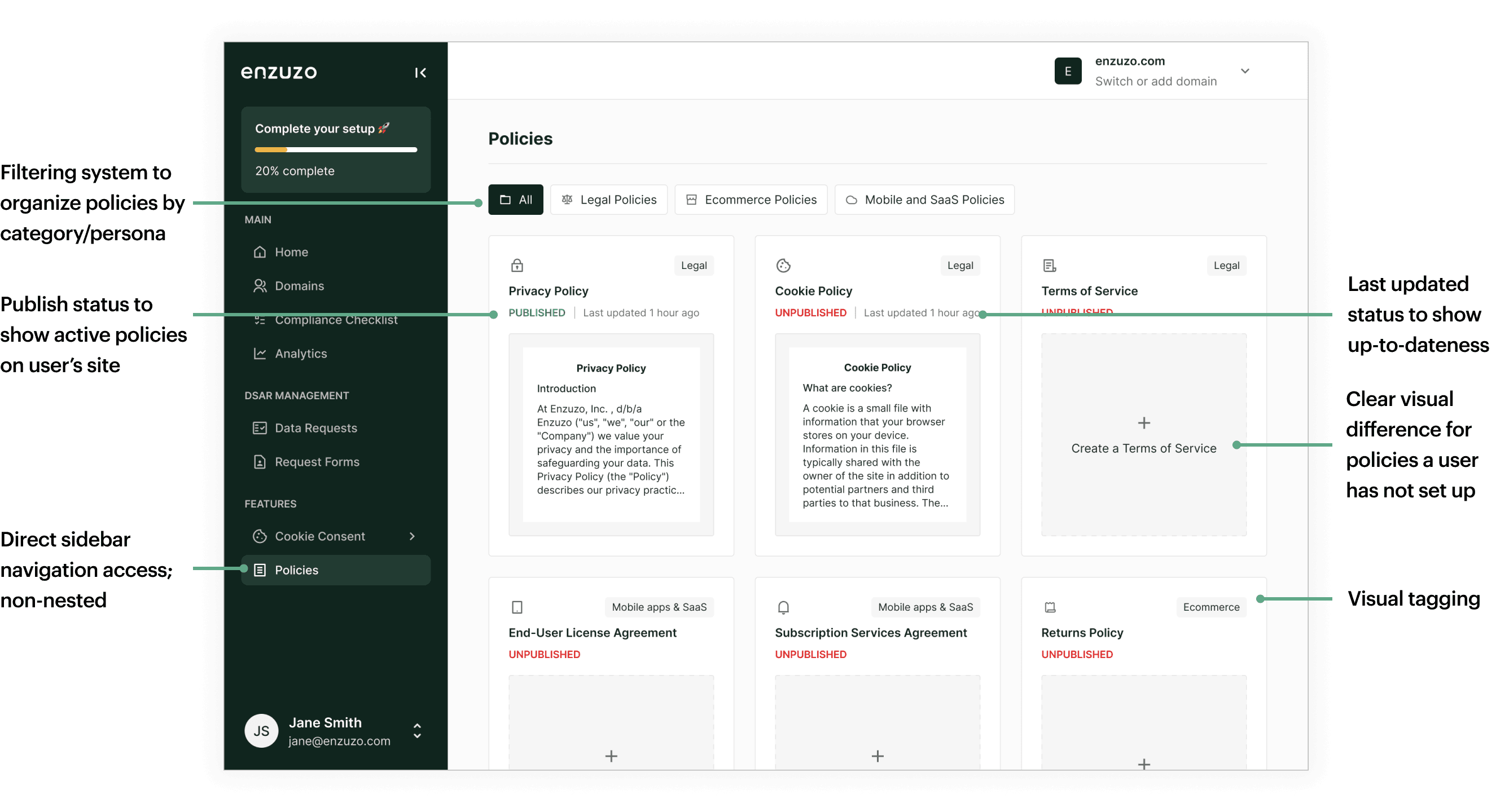
Policies page - simple visual access to secondary features.
Great! Now users know exactly what they have and what they don't, without having to visit multiple individual screens.
REFLECTION
Results
This the last project we finalized before I left Enzuzo, so unfortunately I have not been able to see the results. Nonetheless, I learned a lot of valuable insights throughout this project.
Takeaways and learnings
🤔
The balance between noise and functionality
Noise cannot be entirely removed from a product—nor is that a sensible aspiration. Most product teams are on a perpetual treadmill of shipping new features and adjusting to the level of noise. Finding the balance between this is grey area and intimidating to tackle. However, taking time to deeply understand your users helps to create insights that lead to delightful experiences.
💗
Constant usability testing
The value of user testing is often underestimated in smaller companies like startups. As it turns out, its importance is immense, and a single user can provide incredible insights. User testing isn't just about improving a digital product; it's about building a strong connection with users.
🖼️
The power of reframing and prioritising
Without a predictable or immediate value anchor, onboarding is hard— retention is even harder. The way options are presented significantly impacts how users perceive and make decisions. As designers, it's useful to leverage this understanding to present information in a way that directs users towards desired actions.
Next steps
Enzuzo still has work to do for the perfect onboarding experience. But improvements, no matter how small, can make a significant difference for your users. Here are some future enhancements we may consider:
Improving the sign-up/log-in page
While this project largely focuses on our in-app onboarding, there are many improvements we can make to our sign-up page to reduce friction. This includes autofocusing on the first field, providing instant input validation, and removing password confirmation. Changing headline copy and using a split screen design for illustrations or customer testimonials can also be added to increase user delight.
Product tour or walkthrough
An interactive experience that includes pop-up modals to help new users navigate the app and identify where key features are found. It could be onboarding specific or feature specific, like a walkthrough. This would require lots of user testing, but if done right, can increase overall user experience.


